
In fact I've been taking tons of photos (over 300!-99% of which need to be deleted :0)
for the shop these past few days.
Never sure which way I like the backgrounds best. Maybe you can help me here...
Honestly, I'm not really too fond of many of my photos~ since I seem to never be able to get the same effect twice with lighting and so forth, my shop tends to look inconsistent. I'll take one good 'exterior' of 'item x' shot, then the rest will be bad, or the back looks good on a different paper, the inside of said item is better in the photo shot inside the house and so on...Hit and miss. So all 5 of my photo slots are all different. Let alone all the items in the shop.
But, is that always a bad thing? Having different backgrounds for each item? I don't know.
I like shops that have the same white or plain colored, light box style backgrounds consistently... But I also like shops that have a different background in different photos-(but always the same general style). Eclectic?
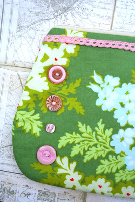
I've recently tried trees in the background~ Nature:
 Eh, it's so-so. And too bright, yet somehow dark all at the same time.(?!) :0
I've tried plain paper like this:
 Greens and blues don't work for everything-it seems to kill the color of most of my things-and doesn't go with everything. I need large paper, this color seems to be the only one I have in 'large' in my collection... and I haven't found a good resource since moving here, how I miss my old resource. Moving on...
So then I try a neutral like this, with smaller scrapbook papers-which tend to be too small- with some swirls or words or 'texture' to keep it from being too boring:
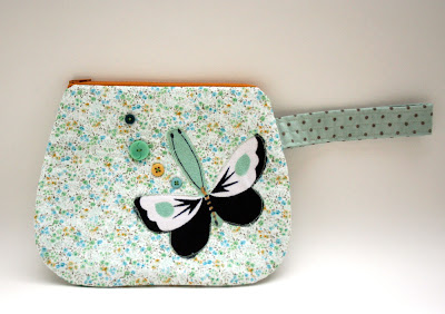
 :0 i can never get the colors in this wristlet right :0
 :0 i can never get the colors in this wristlet right :0
But, maybe that's too busy.
So, I've taken a bunch more, on plain white backgrounds....What do you think?
Too 'vanilla'? It's pretty straightforward. Colors are true to life. No distracting background. White goes with everything. No?
I don't know? Boring? Good?
Which way do you prefer photos for your shop? Plain ? Nature? Subtle patterns? Colors? White?
I'm going to try this white out and see how it goes. Maybe. I can always change it back : )
O.k-I have to go paint a laundry room.When it's all done. I'll show before and after photos. If I remembered to take 'before' shots!
Happy Weekend!
So, I've taken a bunch more, on plain white backgrounds....What do you think?

Too 'vanilla'? It's pretty straightforward. Colors are true to life. No distracting background. White goes with everything. No?
I don't know? Boring? Good?
Which way do you prefer photos for your shop? Plain ? Nature? Subtle patterns? Colors? White?
I'm going to try this white out and see how it goes. Maybe. I can always change it back : )
O.k-I have to go paint a laundry room.When it's all done. I'll show before and after photos. If I remembered to take 'before' shots!
Happy Weekend!


8 comments:
Love the new look!
I always find it difficult too, to figure out the backgrounds, so I tend to stick with the creamy/white colour myself. I think your items stand out beautifully on a simple background.
I like the vanilla....showcase your work, not the background in my opinion! These are so cute....
I read a blog once where the girl made a light box for her work, it kept the colors true. I'll try to find it for you, but basically, it was a box with a light overhead, I think the box was white on the inside....but the colors stayed their true colors photographed in the box.....I'll go looking for it!
I like the white background best. I know with my products, I always want to get creative with color, too and after it's all said and done, I always like the plain white best. Your pictures are great and I love your banner!
Your work is so lovely. I understand about the photo taking, I'm a photographer and I still get it wrong some of the time.
With the first one it looks like you shot it using flash. It is better not to use flash outside, natural light will give you the more realistic colour in your fabrics.
On your piece using the map background, try not to use backgrounds that are too busy, it competes with your piece and it gets lost in the mix.
Also, the last piece you have too much shadow.
If you go to the forums and search for questions about photography there are some great tips there.
Hope that helps. Have a lovely Day, T. :)
Hi Andrea - i like your blogheader, it looks graet! And i think it's a good thing to experiment with photos like you did. For the shop, maybe white background is best, but otherwise i really love nature and papers as well. Blogging is so great because we can find out about these things ;) Have a lovely evening!
Hi Andrea, I like your new blog banner! I don't have an Etsy shop, so maybe I don't really understand the whole background thing. I think the stuff in your shop looks nice. I think each item calls for it's own background right? My eye always goes to either white, nature like trees, stones, water...I say just play around and see how it goes! Good luck with the painting!
thanks everyone-i really appreciate your input!!i think i will gradually work with the white background and see how that goes...
:)
i've been messing with backgrounds lately too.. i keep getting drawn into plain, simple colors. it helps your work do the work, i guess.
so, i'm another fan of the natural vanilla background!
love your new banner too, looks great :)
Post a Comment